The Product.ai logo is the cornerstone of our visual identity. The Octahedron symbolizes the multidimensional nature of AI-powered product intelligence—transforming raw data into actionable insights from every angle.

Product.ai Dimensional Logo

The Origin Story

01 OUR STARTING POINT

Our challenge was to give form to something invisible: the truth. So our logo exploration started with what we do. We take chaos and forge it into clarity. Our exploration started with a diamond—the ultimate artifact of transformation.

02 FINDING THE PERFECT SHAPE

We explored dozens of diamond forms—cuts, facets, perspectives. We were looking for something that felt inevitable, not designed. One shape kept pulling us back: the Octahedron. Eight faces. Six vertices. Perfect symmetry in every axis.

Finding the Perfect Shape
03 PLATONIC SOLIDS

When we researched the octahedron, we found Plato. He believed the universe was built from five perfect solids—each one an element. The octahedron? That's Air. The element you can't see, but feel everywhere. That's our challenge too. ProductAI is real, but it has no body. The octahedron gives it one.

Platonic Solids
04 FULL CIRCLE

When we looked at the actual molecular structure of a diamond—the thing we were using as a metaphor—we found octahedral interstitial sites. The geometry we kept coming back to wasn't just a symbol. It's literally how diamonds are built. We didn't find a metaphor. We found the truth.

One Geometry. Five Roles.

The Octahedron is perfectly symmetric from every angle. One form, interpreted five ways—each revealing a different facet of what we do.

One Geometry, Five Roles

Primary Logo Lockup

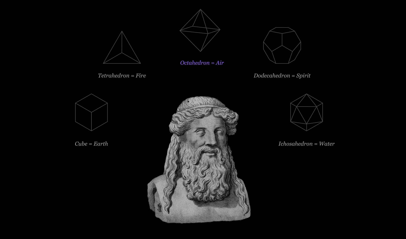
Our Primary Logo Lockup combines the Octahedron with a custom wordmark. We use this lockup for all purposes—external communications, marketing materials, partnerships.

Light Backgrounds

Use the black version on light backgrounds. The black logo is optically adjusted to match the visual weight of the white version — never convert one to the other. Always use the provided source file for each.

Dark Backgrounds

Use the white version on dark backgrounds
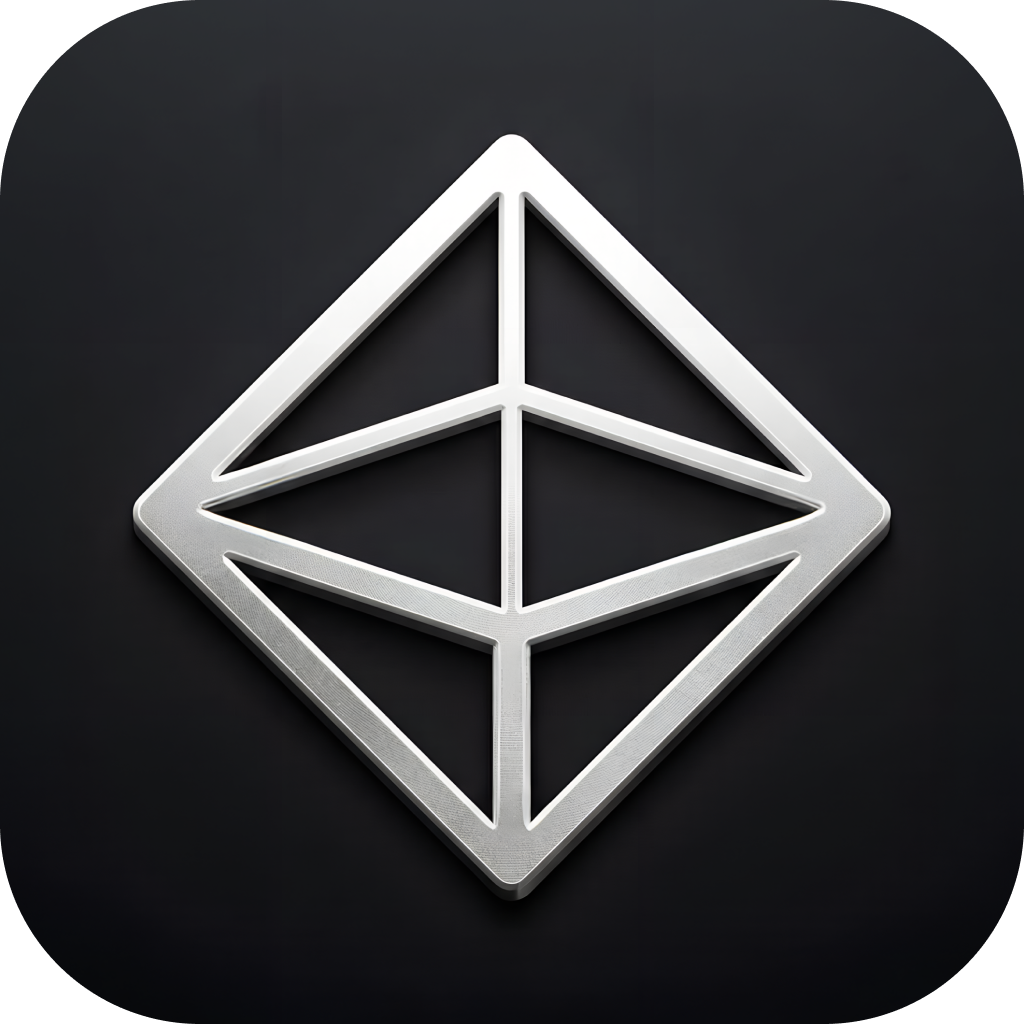
Dimensional Lockup
Premium

Dimensional Version

Gradient treatment for hero moments, app icons, marketing

Wordmark

At times, you may need our wordmark without the Octahedron. This comes in handy for places like footers or where our primary logo already appears elsewhere.

Light Backgrounds

The black logo is optically adjusted to match the visual weight of the white version — never convert one to the other. Always use the provided source file.

Dark Backgrounds

Dimensional Wordmark
Premium

Dimensional Version

Subtle gradient for depth in premium applications

Symbol

Our symbol can be used independently. We use this on layouts where the wordmark appears elsewhere, on social avatars, favicons, and app icons.

Light Backgrounds

The black symbol is optically adjusted to match the visual weight of the white version — never convert one to the other. Always use the provided source file.

Dark Backgrounds

Dimensional Symbol
Premium

Dimensional Version

Gradient treatment for app icons and hero moments

App Icon & Favicon

The dimensional octahedron is the face of Product.ai at small scale — browser tabs, home screens, social avatars, and email signatures. This 3D rendering adds depth and materiality to the mark, giving it presence in contexts where the flat symbol would lose definition.

Product.ai 3D app icon — dimensional octahedron on dark rounded square

Dimensional App Icon

The primary icon for app stores, home screens, and social avatars. The octahedron is rendered with metallic depth on a dark rounded square — giving the flat geometry a tactile, three-dimensional quality that reads at every size from 16px to 1024px.

Product.ai favicon shown in browser tab

Browser Favicon

The dimensional icon in its smallest context — the browser tab. The 3D rendering preserves recognizability better than the flat wireframe at this scale, ensuring the mark stays legible at 16 × 16 pixels.

Product.ai email signature — dimensional icon with name, role, and links

Email Signature

The dimensional icon anchors the email signature at left. Name with pronouns in bold, role in gray, then product.ai as a violet link alongside simplycodes.com. No dividers, no taglines, no banners — just the essentials.

Where to use

Use the dimensional version wherever the octahedron appears without the wordmark at small scale: favicons, mobile app icons, social profile avatars, email signature icons, notification badges, and loading states. The flat wireframe symbol is still preferred for in-layout usage at larger sizes and anywhere the mark sits alongside the wordmark.

Spacing & Placement

The clear space around every version of the logo equals the width of the octahedron icon. This safe zone must remain free of text, imagery, and other graphic elements on all four sides.

x x x x x = icon width

Clear Space — Symbol

The octahedron icon requires a clear zone equal to its own width (x) on all four sides.

x x x x

Clear Space — Primary Lockup

The full lockup (icon + wordmark) uses the same rule: the clear zone on every side equals the width of the octahedron icon within the lockup.

x x x x

Clear Space — Wordmark

When the wordmark is used independently, the same clear zone (x = icon width) applies to all four sides. Even without the icon present, reference the standard icon width as the measurement unit.

Minimum Sizes

Below these thresholds the octahedron facets lose legibility and the wordmark becomes unreadable. Always default to a larger version when possible.

48px Recommended 24px Minimum Print: 0.25" (6.35mm) min

Symbol

Digital: 24px min, 48px recommended
Print: 0.25" (6.35mm) minimum

36px Recommended 20px Minimum Print: 0.5" (12.7mm) min

Primary Lockup

Digital: 20px height min, 36px recommended
Print: 0.5" (12.7mm) minimum width

16px Recommended 10px Minimum Print: 0.75" (19mm) min

Wordmark

Digital: 10px height min, 16px recommended
Print: 0.75" (19mm) minimum width

Corners & center — approved Arbitrary float — avoid

Placement

Anchor the logo in corners or centered — top, bottom, or middle of a layout. Never float the logo in arbitrary positions between grid lines. Consistent anchoring reinforces the structural precision of the brand.

Separated Usage

The octahedron mark and the Product.ai wordmark can live apart within the same design. When separated, each element carries the brand independently — the mark as a visual anchor, the wordmark as a verbal one. Follow these rules to keep both elements working in concert even when they're not touching.

When to Separate

  • The design surface is large enough for both elements to breathe (slides, posters, signage, web pages)
  • You need the mark as a corner anchor and the wordmark as a headline or footer element
  • The lockup would compete with other content at the required size

Rules

  • 01Both elements must appear on the same surface — never split across pages or screens
  • 02Anchor each element to a grid edge or corner — no floating in open space
  • 03Maintain a minimum separation of 4× the mark width between the two elements
  • 04Both must use the same color treatment (both white, both black, or both dimensional)
  • 05Clear space rules still apply to each element independently

Approved Placements

Mark top-left · Wordmark bottom-right

Diagonal Opposition

The strongest separated layout. Mark anchors top-left, wordmark anchors bottom-right. Creates a diagonal reading line across the full canvas.

Mark top-right · Wordmark bottom-left

Mirrored Diagonal

Same principle, flipped axis. Mark anchors top-right, wordmark sits bottom-left. Works well for right-to-left scanning layouts.

Mark top-center · Wordmark bottom-center

Vertical Stack (Separated)

Mark centers at the top of the canvas, wordmark centers at the bottom. Content lives in the middle band. Best for tall formats — posters, stories, digital signs.

Out of proportion — use the primary lockup

Avoid: Disproportionate Sizing

When the mark and wordmark are wildly different sizes, the relationship breaks. If they need to be near each other at similar scale, use the primary lockup — that's what it's for.

Same line — reads as a broken lockup

Avoid: Inline Placement

Placing the mark and wordmark on the same horizontal or vertical axis at close range looks like a lockup with a gap. If they're on the same line, combine them into the official lockup.

Mixed treatments — both must match

Avoid: Mixed Color Treatments

The mark and wordmark must always use the same color treatment. A violet mark paired with a white wordmark (or any mismatch) fractures the identity. Pick one — white, black, or dimensional — and apply it to both.

Partnerships

We approach each partnership differently, so reach out to find the best logo lockup. All three logo versions can be used in co-branding — choose the format that best matches the context and the partner's mark.

Symbol

×

When to Use

Best for compact co-branding where space is limited — app icons, favicons, social avatars, or small placements where only icons are used by both brands.

Rules

Match visual weight with the partner icon. Use a vertical divider bar or "×" between marks. Minimum spacing between logos = 1× icon width.

Primary Lockup

Product.ai
Partnerco
Product.ai
×
Partnerco

When to Use

The default for most co-branding. Use when both brands need full name recognition — marketing materials, landing pages, press releases, event signage.

Rules

When Product.ai leads: our lockup should be larger or equal in size. Equal partnership: match visual weight. The divider height should match the icon height within the lockup.

Wordmark

Product.ai
Partnerco
Product.ai
×
Partnerco

When to Use

When the partner's mark is also text-only, or in editorial and typographic contexts — blog headers, article bylines, document footers, or inline credits.

Rules

Align baselines when possible. The divider height should match the cap height of the wordmark. Never pair the wordmark with a partner's icon alone — use our icon instead.

Universal Partnership Rules

Minimum spacing between any Product.ai logo and a partner mark equals 1× the icon width. Never alter, recolor, or distort the Product.ai logo to match a partner's brand colors. When in doubt about which format to use, reach out to the brand team.

The Expressive Octahedron

Reserved for special moments—motion graphics, art installations, brand films. The expressive 3D version adds drama but sacrifices the engineered precision of our primary mark.

drag to influence • scroll to zoom

Use sparingly. The expressive mark is for premium, hero moments only—never for UI, documents, or co-branding.

What Not To Do

✗ Don't Fill It

The inside of our Octahedron should always be transparent, showing through to the content behind it.

✗ Don't Rotate It

Always keep the Octahedron upright. The vertical line should always run top to bottom.

Crowded

✗ Don't Crowd the Octahedron

Keep elements at least half the icon height away from the logo.

✗ Don't Change Colors

The Octahedron should only appear in white, black, or AxI Violet. No gradients, no off-brand colors.

✗ Don't Alter Line Weights

Use only the provided logo files. Never recreate or modify the Octahedron's proportions.